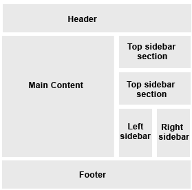
now you have an idea what we are going to build lets get started. I recommend you use a test blog for this tutorial using the minima template i always use this template because its an easy starting point once you have your template go to layout > Edit HTML scroll down and delete the width from within the CSS #header-wrapper
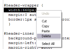
this enables the header to span the entire width of whatever we set the
#outer-wrapper to. Do the same for the #header .description and the #footer see screenshots below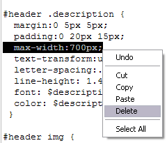
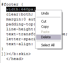
Now change the width of the CSS code for the
#outer-wrapper from 660px to 960px and the width of the #main-wrapper from 410px to 530px and the float to left like I've done in the screenshots below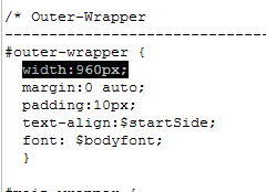
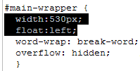
Next find the CSS code for the
#sidebar-wrapper and change its ID to #column_wrapper and the width to 410px and the float to right see screenshot below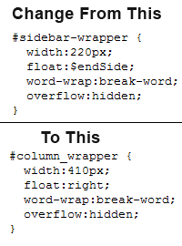
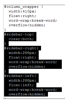
now we will create the CSS code for the two right columns and the top section above them so copy the following code
#sidebar-top{

clear:both;

}

#sidebar-right{

width:200px;

float:right;

word-wrap:break-word;

overflow:hidden;

}

#sidebar-left{

width:200px;

float:left;

word-wrap:break-word;

overflow:hidden;

}
paste it in your template like I've done in the screenshot below
scroll down and find the
<div id='sidebar-wrapper'> and change the ID to <div id='column_wrapper'> then just below there change the ID of the sidebar section to id='sidebar-right' so it becomes a right column in the sidebar not sure ? see screenshot below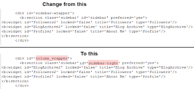
now we are going to create the top section and the left column for the sidebar so copy the following code
<b:section class='sidebar' id='sidebar-top'/>

<b:section class='sidebar' id='sidebar-left'/>
paste it just below the
<div id='column_wrapper'> see screenshot below if you are not sure
now add this final bit of CSS code just after the
#footer if you are not sure where to add it see screenshot after the code/* wire frame layout tweaks */
body#layout #outer-wrapper{width:750px;}
body#layout #main-wrapper{width:310px;}
now if you save your template and followed this tutorial right you should see this on you page element tab
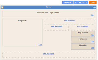
i may show you some more tweaks with this template in another tutorial check my result live HERE i hope you enjoyed this tutorial and don't forget to share and leave your comment
214 Responses to “Create a 3 column blogger template with 2 right columns”
Anonymous
January 19, 2009Just learned about this design through Lawny's generous tip at Blogger Help. Needless to say, this is the kind tutorial bloggers usually can only dream about finding after endless searches. Finally, here it is and I, for one, can't wait to feast upon it.
Anonymous
January 20, 2009Great! Thanks, man!
I think I did it right.
Was just wondering if I was supposed to include this line ...
"/* wire frame layout tweaks */"
in the last instruction after the footer.
Thanks a lot.
Lawny
January 20, 2009@PinoyXfat
No you dont really need that line thats just a comment in the code but you need the code just below that so it doesnt mess up the page element tab
Anonymous
January 21, 2009thanks again. i practised tweaking using a testblog.
was wondering whether you plan to share tips in future on how to tweak colors or rearranging some unnecessary elements such as lines between widgets. or changing the font of the body in the sidebar.
:) i'm asking for too much.
Lawny
January 21, 2009@PinoyXfat
good suggestion i will be doing a lot more tutorials for blogger subscribe to my feed and you will get notified via email when new content gets posted
Ching Ya
February 08, 2009Hi Jamiz, nice tutorial. Do you think it's possible to change mine into what you've just shown? It has always been a 2 column template, just wondering before I do anything I'll regret.
Lawny
February 09, 2009@Ching Ya
yes it would be possible however the widths may need adjusting according to your site i recommend downloading a backup copy of your template and uploading it to a test blog if you are finding it too difficult send me an email and let me know
Anonymous
February 10, 2009Tried it. It worked great. I love it. Paul Lawn is the Best Blog help on the web. Check it out my results: radiationcinema.com
Lawny
February 10, 2009@Radiation Cinema
that was quick the last time i looked at your blog it was only 2 columns now it looks great
Anonymous
February 10, 2009Thanks be to you, my freind.
PillowNaut
February 14, 2009This is awesome, I've been playing with it on a test site and hope to implement :) Question... how do you get the top sidebar to the bottom? Like if you want the dual columns under the header and your "Top Section Sidebars" beneath those? Tried a few obvious reversal attempts without success...
Lawny
February 14, 2009@PillowNaut
to get the top section below the columns just paste the code after the closing </b:section> tag so your code will look something like
<b:section class='sidebar' id='sidebar-left'/>
<b:section class='sidebar' id='sidebar-right'>
<b:widget id='BlogArchive1' locked='false' title='Blog Archive' type='BlogArchive'/>
<b:widget id='Profile1' locked='false' title='About Me' type='Profile'/>
</b:section>
<b:section class='sidebar' id='sidebar-top'/>
PillowNaut
February 16, 2009ROCKS! :) Thanks for the added lines, it turned out great, this was a wonderful tutorial :)
Lawny
February 16, 2009@PillowNaut
glad you enjoyed my tutorial ;-)
The-One
March 02, 2009Cool nice tutorial...use it to make a 3 column template XD (that was before I noticed that you had make a tutorial for that too :P
Whats great about it is that even if I sux at CSS this tutorial made it easy for me to understand how easy it is to change stuff even if I don't want to make my template exactly like yours. Well had a few problem but they were easily fixed :3
Thanks again for this great tutorial XD
Lawny
March 02, 2009@The-One
I'm glad you found it easy to follow and thanks for the comment
Anonymous
March 12, 2009i made these change to template but if i edit my template and view blog the 'top sidebar section'
jumps into right sidebar
Lawny
March 13, 2009@blogtrix
did you follow the tutorial right ? where is the site url you have done it on ? mine works fine so maybe you have made a coding error
Anonymous
March 13, 2009bloggertrixntips.blogspot.com,the email subscription widget is in top side bar but once i edit html it jumps to right side bar
Lawny
March 14, 2009@blogtrix
i looked at your blog in firefox,ie7,safari and opera and it looks fine to me i don't know what you mean by editing your html well if you leave any tags open they will mess up your layout
Anonymous
March 15, 2009i meant whenever i did any changes to my template through edit html
Lawny
March 15, 2009@blogtrix
yes well like i said if you edit the html and don't know what your doing it is bound to mess the layout up what are you trying to edit the html for ?
Anonymous
March 15, 2009i have sorted it out by deleting height and width properties for the widget,now its working fine for me ,thanks 4 ur code and your help
Lawny
March 15, 2009@blogtrix
ok no problem thanks for your comment
KurlyBella
March 20, 2009this is a wonderful tut! i've already implemented it on my site in juse a few hours. by copying my widget codes before doing so, it was so easy to update my site:
http://kisforkinky.blogspot.com/
this may seem like a silly question, but how do i add the top side bar section under my left and right side bars?
i want it to flow like this:
top side bar
top side bar
left right
top side bar
make sense?
i feel like if i change anything i'm gonna mess up!
Lawny
March 20, 2009@Kurly Bella
Add another id to the CSS code like
#sidebar-top,#sidebar-bottom{
clear:both;
}
next create a bottom section like below
<b:section class='sidebar' id='sidebar-top'/>
<b:section class='sidebar' id='sidebar-left'/>
<b:section class='sidebar' id='sidebar-right'/>
<b:section class='sidebar' id='sidebar-bottom'/>
i hope this helps you
KurlyBella
March 20, 2009thanks so much, and one last question. my header image was working before this css.
i can see it as a page element option as in your graphic above and it's showing as uploaded when i click on the element to upload - it is showing as show image "instead of title and description" but still no pic.
i compared the html to my other blog which is in the original minimi and made some small minute changes to my new layout after i compared them - which would not affect the pic showing anyway.
what gives do you think?
Lawny
March 21, 2009@Kurly Bella
changing the code should not effect the header image element from working you could add an image by finding the following code
#header-inner {
background-position: center;
margin-left: auto;
margin-right: auto;
}
add a background property like sample below
#header-inner {
background-position: center;
margin-left: auto;
margin-right: auto;
background: url(http://www.photobucket/albums/someimage.jpg) no-repeat;
}
KurlyBella
March 21, 2009thank you! wonderful tut!
i also added a top sidebar section to this layout directly under the header. i think this would be good for optimizing ads or adding in buttons.
Melanie Elissa
March 23, 2009i have tried your instructions 3 times now and i am still having trouble. my two columns show under all my posts?? please tell me what i am doing wrong!! thanks
Lawny
March 23, 2009@Melanie Elissa
Hi i'm not sure what you have done wrong you will have to send a copy of your template to my email address so i can look at your code also it could be your post's because if you miss any closing </div> tags in your blog post's it will mess up your layout
Ramesh
March 23, 2009m very very new to this.and i have just one post in my blog and i wanted something very special on my template. I did exactly what you've domonstrated on your blog. I JUST SAW AFTER SAVED. wow, that was really amazing dude.
Kayla
March 25, 2009THANK YOU!!!!!!!!!!!!!!!!
Beth
March 26, 2009This is so great. It is well explained and easy to follow. Thank you so much!
Will you tell me how to delete the lines between the widgets?
Lawny
March 26, 2009@Beth
Glad you enjoyed my tutorial which line's between the widgets do you mean ?
Beth
March 26, 2009Actually, I figured that part out... but I do have another question. :)
If I look at the "Add and Arrange Page Elements" screen of Blogger, I see what you showed above (how the three columns with two right columns should look). My question is this: I have 6 "gadgets" (widgets?) on the right, and one on the left. I'd like to add more on the left, but when I try to move them from the right, they won't stay. What am I doing wrong?
I'm so new to all of this, and I appreciate how beginner-friendly everything is! Thank you so much!
Anonymous
March 26, 2009I think I am making the same mistake as @Melanie Elissa since my columns show up under my blog as well. What was her error? Thanks for this great tutorial.
Lawny
March 26, 2009@Beth
you should be able to drag them to the left or right section what browser do you use ? could you upload a screenshot of the problem
@Anonymous
I dont know what you have done wrong but the most likely cause is you have not followed the tutorial right or one of your blog post's may have a missing </div> tag or something i cant check since you didn't leave a link to your blog
Anonymous
March 26, 2009I got it to work my blog is www.susidjewelry.blogspot.com
I am new to all the html stuff and your tutorial gives me hope that I will be able to do it as well. How can I change the font for the gadget titel to the one I use in my banner (pam's hand)?
Beth
March 26, 2009I use Firefox (3.0.7). I know how to take a screen shot, but I'm not sure how to upload it here. I can't drag things from the right to the left. Well, I can, but they won't stay put -- they just fly right back over to the right.
Anonymous
March 26, 2009You did an amazing job breaking it all down. Even I was able to use it :)
I would like to change two things and maybe you can help:
1* how can I change the column header font to match my banner (Pam's hand - font)
2* can I add a division line between the columns to make it easier to read?
Thanks!
Lawny
March 27, 2009@Susan
im not sure what you mean by pam's hand font but if you wanted to use fancy fonts like what are in the header you would need to create an image because not all visitors will have the fonts installed on their computers and it would mean that you need to edit the code for every single widget title which wouldn't be easy unless you know XHTML and CSS as for a division line between the two columns the best way to do it would be to create a blank image the same width as the column wrapper then create a border in the center of that image then finaly slice the image into a 1px height image then repeat it downwards on the content-wrapper so the border would grow vertically
@Beth
I'm not sure whats wrong with your layout but i just tested mine in firefox (3.0.7) on windows xp and i can drag my widgets between the left and right columns. Are you hitting the save button after dragging the widgets ? you can use tinypic to upload screenshots and copy the direct link and paste it here but like i said it works for me
Beth
March 27, 2009No, I can't click save -- because the widget will not stay in the left column. It won't stick. It shoots immediately back to the right.
Here's a shot of me trying to move one of the widgets. You can see that there's a dotted box on the right where it will stick -- but that doesn't happen on the left.
http://i39.tinypic.com/34436tz.jpg
I appreciate your help!
Beth
March 27, 2009Ok - it suddenly just worked! I am silly! Thanks for everything! I'll probably be back.... :)
Jennisa
March 27, 2009can you give me your email? I have it set up, but something is off with the margins and I'd like to provide you with a screen shot of what my element page looks like...thanks my email is jennisajoy@gmail.com
THANKS
Lawny
March 27, 2009@Beth
glad you got it working
@jennisa
Use contact link to email me what problem are you having ?
Beth
March 27, 2009As promised... here I am! :)
How can I change the backgrounds of the two sidebars? More importantly, how can I make each of them different?
Thanks again... you're awesome!
Beth
March 27, 2009And one more thing. :) (Are you tired of me yet?) If you look at my blog you can see the little heart I tried to place beside the comments link (it's not a very good heart, though -- do you know of a place to find small heart icons with transparent backgrounds?). How can I space the word "comments" over a few spaces so it's not right on top of the icon?
Lawny
March 29, 2009@Beth
I use photoshop to create transparent images as for changing the sidebar backgrounds it would include writing more code to get them how you want them also it would include me having to look through your code which i dont have time for unless you want to hire me
Rebecca
March 29, 2009This was fantastic! Thank you so much, very clear directions and it worked!
The Great Brown Experiment
April 01, 2009thank u soooo much. this step by step tutorial was a great help to me! *thimbs up*
admin
April 02, 2009Worked the first time i tried it. Thanks a bunch! http://pccblogs.blogspot.com/
admin
April 02, 2009Thanks a lot this is such a great tutorial! Just added your site to favorites! From http://pccblogs.blogspot.com/
Lawny
April 02, 2009@Brownfox
Glad you enjoyed my tutorial thanks for your comment
Aftab Ahmad
April 02, 2009Thank you very much. This is the kind of tutorial I was searching since long.
rpthomas04
April 03, 2009Thank Youuu!!!
Your instructions were so easy to follow...and i didn't even have to download any new 3 column templates.
Keep adding great features.
Lawny
April 03, 2009@rpthomas04
glad you enjoyed my tutorial
Arnel
April 05, 2009hello,
I would like to ask what is the following code for:
/* wire frame layout tweaks */

body#layout #outer-wrapper{width:750px;}

body#layout #main-wrapper{width:310px;}
I am converting the denim template to 3-column. I tried deleting the above code and it still works. Is the above code necessary for Denim?
Lawny
April 05, 2009@PC Journal
the code you are talking about only works for the Page Element tab if you remove the code and go to your Page Elements tab you will see that the layout is messed up abit so really if you are not bothered about it you wont need that code it doesn't effect your layout.
kristin maynes
April 05, 2009AWESOME!! Thank You so much..I've been looking for this *EXACT* template for months.
Saniur Rahman
April 06, 2009Awesome !!!
woooow...thank's
Arnel
April 06, 2009Hello again. I tried separating the sidebars to the left and right of the page with my posts being at the center (have to discard sidebar- top). A problem occurred such that the web page is displayed to the left of Firefox. Same with Chrome, Opera and Safari. But not with IE7! Any help on this one on how to center the web page on Firefox, etc?
Lawny
April 06, 2009@PC Journal
Are you trying to create a 3 column layout ? if so try this post what is the url of the site you are trying this on ?
Lisa
April 06, 2009It worked! THANKS!
2emkay
April 09, 2009Thank you thank you thank you thank you thank you!!!!
Wil be back for me!!!
Anonymous
April 09, 2009Help! My top sidebar is too long shifting everything else under the main content area. How do I fix this?
Lawny
April 10, 2009@Emi
Your blog looks fine to me i assume you have fixed it ?
Satyaki Mitra
April 12, 2009great tutorial.but blogger is saying,variable right not defined,please help.
Lawny
April 12, 2009@drmartyr
I'm not sure what error you are getting but we do not use variables in the tutorial described above maybe you have deleted one of the variables from the top of your template ? could you upload a screenshot of the error to http://tinypic.com and paste a link to it here so i can have a look
Anonymous
April 15, 2009Great template!!
I was wondering if there was a way to make the space between the posts on the right and the widgets on the left bigger?? Everything looks sort of smooshed. Any help would be great! Thanks.
Ujwal
April 17, 2009Thanks! That was a good learning. I learned a lot about things to create and edit bloggers.....
Lawny
April 17, 2009@Joie de Vivre
i don't know which space you are talking about
kojj.com
April 17, 2009thanks for the info
Anonymous
April 17, 2009Sorry, I got frustrated with this layout and ended up changing it yesterday. I'd really like to change my blog back to this template you're showing us. However, I want to know how I can put more space between the right side of the main content area and the left side of the sidebars?? Is it a resolution problem? I hear some blog templates change do to the different widths.
Hope that makes sense :)
Lawny
April 17, 2009@Joie de Vivre
you just need to adjust the padding on the main-wrapper and sidebar
Anonymous
April 17, 2009Thanks!! Do you know how I can do that? When I tried changing the padding my sidebars moved under my main content section, so I guess I did something wrong ;o)
I appreciate the feedback!!
Lawny
April 18, 2009@Joie de Vivre
if you set the main-wrapper's width to 500px and apply 10px padding on the left and right the total width would be 520px wide. So you would need to set it at 480px wide and apply 10px padding on the left and right so it totals 500px or whatever you need
bobbie
April 20, 2009Wow thanks for sharing this, Ive been searching for some clear and easy to understand instructions on this its nice to finally find some ;D
Anonymous
April 22, 2009Thanks a lot. I did not put the
/* wire frame layout tweaks */
as what pinoyxfat said, and it turn out to be fine.
Cheers, kevinn
Lawny
April 22, 2009@Anonymous
you don't need them if you are not bothered about it messing up your page element tab
The Blogger
April 27, 2009Hello,
I am trying to figure out how to have a layout like http://kayleighannefreeman.blogspot.com I want to have the 3 columns like that. But I am not sure what coding needs to be changed. Please advise
Lawny
April 27, 2009@Andrea
You can try this 3 column tutorial or hire me to code your blog
Marci
April 28, 2009Great tutorial. Very easy to follow.
Anonymous
April 28, 2009For some reason I have a far right column and a far left column but not the 2 columns on the right. NOt sure what I did wrong?
Lawny
April 28, 2009@Jill
what is the blog url you are trying this on ?
Anonymous
April 28, 2009http://zabbysmomsaves.blogspot.com
Lawny
April 28, 2009@Jill
your blog looks ok you need to go to layout > Page elements and drag the sidebar widgets between the two right columns you wont see the other column unless you add widgets to it hope this helps you
Anonymous
April 28, 2009I found my mistake! THANK YOU!
#41x14
April 28, 2009thanks for the code and easy to follow directions!!! plus all your attentive feedback!
next to try: navigation bar!
thanks!
craftYARD.com
SamSeiko
April 30, 2009Thanks a lot...You helped me made all my 2 blogs into 3 columns! Thanks!
The Blogger
April 30, 2009Thanks so much. I tried it and went blog crazy and have several blogs set up with the template you told me about. Again, thank you.
The Black Hour
May 03, 2009Excellent tutorial. WOrked on the first try. The new blog for The Black Hour should be completed by this afternoon.
Thank you.
http://www.theblackhour.com.
Unknown
May 06, 2009I successfully followed your tutorial for minima template. however, while using rounders template, i don't get desired result. the page elements are appearing after the post text. can you fix my error? thanks
my test blog : http://indiasportsscenario.blogspot.com/
Lawny
May 06, 2009@Malhar
this tutorial is wrote for the minima template thats why it works for anyone who follows the tutorial using the minima template
since you are using the rounders template the steps would be a lot different from the one's described above so i cant really help you out since i'm too busy to look through your code for the errors but
i might write a post showing how you can create a 3 column rounded template but i cant promise you
rokokkaya
May 07, 2009very nice lawnydesigns...thanx for sharing
from http://11pips.blogspot.com
Mariposa
May 11, 2009Hi there,
this is a great tutorial but for my case, I cannot see the 2 cols at the top...
Lawny
May 11, 2009@Mariposa
what is the url of the site you are trying this on ? have you been to the page element tab and added a widget in the section ?
Mariposa
May 12, 2009Hi, sorry my internet went dead just after I posted my comment, it's working fine now!
Thanks a lot!!!
Athena
May 26, 2009Thanks so much for posting this. It was the first out of five tutorials that I tried that actually worked.
soloist
May 28, 2009Thanks for posting this tutorial!
Woolytales Miniatures
June 04, 2009Hi Lawny~ I have been looking to modify my woolytales site for while now.... I *really* need a 3 column and *finding* you was just incredibly good.grin. I follow your template changs however; my elements are not right. i went back and checked 3 times and i don't see what I did wrong. *thank you ever so much* , I appreciate you sharing this with all of us! smiles, Pat
Lawny
June 04, 2009@Pat
i just looked at your blog and you have deleted the width of the #main-wrapper so your blog will span to the width of your browser window thats why your layout is messed up you need to follow the steps carefully
Woolytales Miniatures
June 04, 2009ohhhh... I am not sure how I did that but I will restore and try again. You are awsome!Thank you so much!Smiles, Pat
Woolytales Miniatures
June 04, 2009Lawny~ Do your costum work? I am about to pull my hair off my head ,grin...I don't think I can/want to do this anymore...I need HELP! Please, leave me a comment on my blog so I give you my email address? thank you kindly. Pat
TJ Atwell
June 04, 2009Hi, I used your codes exactly and I now have some small right columns and some that are wide and I can't pick where they go and it had screwed up my layout a little. My URL is http://darkfuturegaming.blogspot.com/ I would really like to have three columns in a way that I can control. How do I do this?
TJ Atwell
June 04, 2009http://darkfuturegaming.blogspot.com/
Lawny, that is my URL and I followed your code exactly, but for some reason I now have some of the half legnth right columns, but I also have full right columns as well and it only lets me have the small ones on top, but if you look at my blog, it looks ridiculous. How do I fix it so I have 2 200px columns instead of this?
Lawny
June 05, 2009@Pat
i have already replied to your email
@Old School Terminator
i had a quick look in your source code and it seem's that you have made a typo error your sidebar section is currently like this
<b:section class='sidebar' id='sidebar=right'/>
it should be
<b:section class='sidebar' id='sidebar-right'/>
you have = instead of - correct it that should solve it
TJ Atwell
June 05, 2009Thank you, that fixed the odd placement, but now I just have one big right column istead of two right columns
Lawny
June 06, 2009@Old School Terminator
you still need to correct the section
<b:section class='sidebar' id='sidebar=right'/>
it should be
<b:section class='sidebar' id='sidebar-right'/>
also your CSS is currently like this
#sidebar=top{
clear:both;
}
#sidebar=right{
width:200px;
float:right;
word-wrap:break-word;
overflow:hidden;
}
#sidebar=left{
width:200px;
float:left;
word-wrap:break-word;
overflow:hidden;
}
it should be
#sidebar-top{
clear:both;
}
#sidebar-right{
width:200px;
float:right;
word-wrap:break-word;
overflow:hidden;
}
#sidebar-left{
width:200px;
float:left;
word-wrap:break-word;
overflow:hidden;
}
you have = instead of - correct it that should solve it i suggest you read the tutorial more carefully as one little typo error can mess your blog up
TJ Atwell
June 13, 2009Lawny, thank you, but I just entered in what you posted in your last response to me, as a matter of fact it was copy/pasted and now I still have a group of large right columns on the bottom and two smaller ones on top. If you take a look at the blog, a question I asked for a poll sits in up in the righ corner, but the content of the poll is down below two other widgets. It doesn't do this with the equal signs. Why is it doing this? Is there a problem that hasn't been addressed?
TJ Atwell
June 13, 2009Lawny, please disregard my last attempted post. I fixed it. Thanks for eveything.
aR
June 16, 2009Thanks, I like it.
Anasfadilah
June 16, 2009thank u so much for this tutorial! good job!
Hayley Hewitt
June 17, 2009Hi
I have only just started blogging and on my blog all the links and everything are all just one after the other. Wanted to do 3 colums and spread it out. Tried following these instructions - got onto layouts and the html code - cant even find the 1st bit you talk about. Please can you have a look at my blog ? Can I email you the address? Whats your email address?
Hayley
Lawny
June 18, 2009@Hayley
make sure you are using the minima template if you are using Firefox press Ctrl + F and search for the code described in the tutorial above you can leave your blog url here or email the blog url using the contact link found at the top of the page
Lauren
June 18, 2009Hi, this is a great tutorial. And I got this to basically work...ony problem is that my header spans so much wider than my main column & 2 side bars...it's way off the screen.
Any ideas what might be wrong?
thanks so much.
Lawny
June 19, 2009@Lauren
most likely cause is that you have made a mistake in the code or something what is the url of the site you are trying this on ?
Neil
June 26, 2009Great tutorial, worked very well. Could you explain how I can put a border around the main content section please, I want to draw the eye to this section and at the moment it looks a bit untidy.
Lawny
June 26, 2009@Neil
if you want a border around the main content section find the following code
#main-wrapper {
width:530px;
float:left;
word-wrap: break-word;
overflow: hidden;
}
just add a border like so
#main-wrapper {
width:530px;
float:left;
word-wrap: break-word;
overflow: hidden;
border:1px solid #fff;
}
in the code above i have added a white border change the hex code if you want a different colour here's a link to some hex colour codes
Neil
June 27, 2009Thank you for the quick reply, brilliant.
lotsamanny
June 29, 2009Hi! I tried your hacks on a test template using son of motto. I dont know where I messed up. Check my test blog http://flowerhornfishes.blogspot.com/. It looks ok with 2 right columns and a top sidebar. My problem is when I go layout page. The page elements are not arranged the way they shoukld be. What I have is the Blog Posts box which is alligned to the right then the Top side bar underneath it and the two sidebars underneath the top sidebar. Hope you can picture that. Anyway the problem with that is everytime I load a gadget I get an error message eventhoug the gadgets loads up ok. Hoope you can help me correct whatever I have done wrong. thanks!
Apple4doc
kara's party ideas
June 29, 2009help, i dont' know what happend. but now my blog is all messed up..it was probably me..look at www.karaspartyideas.blogspot.com. can you tell me what i did wrong?
kara's party ideas
June 29, 2009ok, so i played around a little with it..and changed my outter wrapper width to 1200 instead of 960 which seemed to work..it brought the sidebars up to where they were suppose to be {they were at the very bottom before}. it still doesn't look quite right though. my sidebars seemed shoved to the right {near the bottom}. and it also de-activated my font on my sidebar widgets..any idea why it did that? thanks so much!
Lawny
July 01, 2009@apple4doc
This tutorial was wrote for the minima template so if you are using a different one your code's will be all different and i don't really have time to look through them right now
@kara
The header image and the width of your blog is too wide change the #outer-wrapper back to 960px then add this line to the #outer-wrapper
overflow:hidden;
kara's party ideas
July 02, 2009awesome..i had to re-adjust my header a bit..but it worked! thanks so much!
Wanie Idayu
July 08, 2009Hi Lawny! Sorry to bother you again. I managed to get the to put in the top sidebar (thanks to you :)). However, I cannot do the same to get the bottom sidebar no matter how many time i tried. the bottom sidebar jumped to my right sidebar. i want it to look like this:
top sidebar
left sidebar
right sidebar
bottom sidebar
can u tell which part I'm doing wrong? my blog is http://wanieidayu.blogspot.com
or should i send u my template? thanks a bunch for your time. :)
Lawny
July 08, 2009@Wanie
the template your using is completely different from the one described in the tutorial and use's absolute positioning of the elements and i'm working on some site's so i don't have time to look through your code
Wanie Idayu
July 08, 2009It's OK Lawny I understand. :) At least by putting the top sidebar like the one u teach us here, makes my blog looks a little bit different than everyone else who use the same template. So thanks a bunch! :)
Reanna73
July 11, 2009Hi. I just wanna ask you something. Does this work with ANY template and not just Minima? Like, not JUST default blogger templates, but those too, but I mean downloaded templates.
Thanx!
Reanna4eva.
Lawny
July 11, 2009@Reanna4eva
it just depends on how the other template has been coded but i wrote this for the minima template because it takes less steps
Daniel
July 11, 2009Thanks so much! Got it first try.
Learn about blogging here
July 18, 2009Nice post created by you. I'll look for more from you dude...anyway thanks for sharing with us..
Your best friend ramesh
lotsamanny
July 19, 2009Thanks. I have you bookmarked so Ill just check in once in a while just in case you decide to post new tutorials for other blogger templates. Really interested with the ones with space for m125x 125 adds.
Thanks again.
Unknown
July 22, 2009You are my hero! This is EXACTLY what I was looking to do to my blog! Thank you SO MUCH! I'm such a code dummy - this was PERFECT for me. I'll be sure to do a blog post referencing you here shortly. Thanks again!!!
Lawny
July 22, 2009@Becky
Thanks glad you found it easy to follow
ATIFAH
July 24, 2009hye.
u hv give a good tutorial..
but why my title post become smaller. i mean, its font.
Lawny
July 24, 2009@ATIFAH
this tutorial doesn't include changing the post title size so you might of edited the CSS for the post title since you didn't leave your blog url i can't see your site
ATIFAH
July 25, 2009ohh.
luvyouandme.blogspot.com
Lawny
July 25, 2009@ATIFAH
your fonts look ok to me
Sms Fandu
July 27, 2009nice tutorial........
......i'm new in blogging...
can u provides me XML template files of default template......
Lawny
July 27, 2009@Sms Fandu
the default templates are already installed on your blog click "Choose New Template"
Suki
July 27, 2009Hi I am having a blog
http://celebritynewscolumn.blogspot.com/
I tried to add Top Sidebar Section in this blog. But after trying so many times I couldn't follow your instructions. Please help me out. this will be a help from your side
Lawny
July 28, 2009@Suki
you are using a completely different template and this tutorial was wrote for the minima template so i really don't have time to look through your code to find out what you have done wrong
Unknown
July 28, 2009hi
THANKS..
i've tweak my blog template.. it's look great..
http://kakyong72.blogspot.com
Vinod Bangarshettar
August 02, 2009Thanks a lot, it is very easy to follow and understand your steps. Great work...
humbleauthor
August 11, 2009Thank u very much.
Little Lovables
August 12, 2009I just followed this exactly, and all it did was send my middle post section farther to the left and totally removed my right sidebar and the the leftbar is still there??
I've been able to successfully change it before, so I don't know what went wrong this time.
Lawny
August 12, 2009@Little Lovables
you probably made a mistake in the code somewhere what is the url of the site you are trying this on ?
Little Lovables
August 12, 2009yeah, I just figured it out, I was using the minima template, but I had previously changed it to a 3 column!
so, I went back to the 2 column and it worked, but the columns are a little close now, any suggestions on how I can tweak it and maybe even expand the main body?
http://www.littlelovables.blogspot.com
Lawny
August 12, 2009@Little Lovables
just adjust the column and post widths to whatever you need
k Madison Moore
August 16, 2009Thank you. I've looked everywhere for someone to actually do screen shots of where the code goes. This was so helpful. I got it the second time.
You are a great teacher.
Thanks so mcuh,
Madison
http://kmadisonmoore.blogspot.com
Artist
Lawny
August 17, 2009@Madison
Glad you found it helpful you have a nice art blog by the way
Gary Cameron
August 21, 2009Awesome tutorial. Very well explained. Exactly what I was looking for.
Ecommerce web design
September 03, 2009Excellent tutorial. It is very interesting. I really enjoyed your unique article. I will wait for your such interesting posts. Keep blogging.
Aleumdaun Haesbich
September 05, 2009wow.. u really help me out... thanx a lot... u're the best...
ermm btw, how can i change it upside down, i want the 2 columns to be up and the up goes down... :-(
hope u will help me in this problem
Lawny
September 10, 2009@MissEvilDoll
paste the top section below the columns instead of the top
Jill
September 10, 2009THANKS SO MUCH!!!! I really appreciate the help and very clear directions!!
I would like to put a teensy bit more space between my two side bars. Would you have a second to tell me how to do that??
Again, thanks for your super easy tutorial.
Lawny
September 11, 2009@Jill
adjust the widths of the columns
the anonymous walker
October 01, 2009hey !
visit me at www.mitchellevernial.blogspot.com !
my page now is beautiful asyour guidance.
thanks yaww ! =)
Annabelle
October 03, 2009Wow! This has to be the easiest "change your template" tutorial I've ever followed! Thank you so much. You should write a book. :)
...
October 05, 2009Oh my Lord!!!
It really works!
Magic or what?
I am such a blogger newbie but it still works!!!
It works!!!! It does!!!
Oh my Lord, can't wait to try all your other tutorials!!
Lawny
October 05, 2009@EllyAli
Lol of course it will work if you follow the steps right
nancy
October 06, 2009Hi Paul,
I just finished you tutorial and my template is not quite the same as yours. I've gone over the steps a second time and I don't know what when amiss on my end.
Can you have a peak or give some suggestions? I have no "add gadgets" to the right side of my "blog posts". The space to the right of my "blog posts" is entirely empty. I have not "top sidebar" and not "left sidebar" and no "right sidebar".
And, how do I go from "page elements" to making this my choice template?
Thanks,
nancy
Lawny
October 07, 2009@nancy
your blog looks fine to me i assume you have solved the problem
Anonymous
October 08, 2009I just followed this tutorial and it worked great! Just one problem though.. I have two "Main Content" Squares instead of one.. I don't know how to explain it but this is what it does to my blog:
Just go here to check it out..
http://corinazoo.blogspot.com/
Maybe I did something wrong..
Anonymous
October 08, 2009Nevermind. It turns out it didn't have to do with the tutorial at all..
I fixed the problem and I will try the tutorial again =]
Brunette and Pink
October 14, 2009Thank you so much for this! This has been extremely helpful.
Anonymous
October 14, 2009You made my day!
Anonymous
October 17, 2009this was so cool. I have been trying to change my blog layout with pre-designed templates & it's been driving me nuts trying to get them to work without deleting my widgets so thank you for your amazing help
Angie
November 09, 2009I am having trouble with this. Mine look nothing like it should. Help! Here is the link: http://angiestestblog13.blogspot.com/. Thanks,
Angie
Angie
November 09, 2009Ok, don't know what I did wrong, but got it now. Thanks for all your tuts!
inooob
November 25, 2009how to change header size in minima template..?
like you header
Lawny
November 26, 2009@inooob
it is too much to explain how it's done right here in the comments
inooob
November 26, 2009can u send me an email,i really need it..
this my email allstars91@gmail.com ...
thanks
Lawny
November 26, 2009@inooob
i dont really have time to explain things via email right now as im very busy thats why i have not updated my blog yet
inooob
November 26, 2009okey...can u make a tutorial how to make it? in u blog
Lawny
November 26, 2009@inooob
i might write one when i get time but i'm not promise anything
inooob
November 26, 2009Okey..thanks
Rants & Raves in Seattle
December 09, 2009Fabulous!!!
drgmemoir
December 12, 2009Thanks for sharing this to us.. God bless :-D
Anonymous
December 16, 2009Thank you so much!
Lauren @ with two cats
December 20, 2009This is fantastic - the most user-friendly step-by-step tutorial I have found.
One thing I was wondering is if it is possible to have the blog header on the left spanning only the area above the main wrapper and the sidebar elements higher up on the right hand side (beginning in the area that would remain next to the header)?
Not sure if that makes sense or not. (Kind of like this blog http://www.brynalexandra.blogspot.com/) Thanks again!
Lawny
December 20, 2009@LaurenH
yes it is possible to create any kind of layout on blogger
BellaMariposa
January 19, 2010thank you thank you thank you!
SadiyanaSadikin @ $$
January 23, 2010thank u so much!
Shell
February 24, 2010Took me a while to get it, I finally did it.
Thanks, Lawny.
Halley
February 25, 2010After several attempts with other people's tutorials that didn't work...I found yours and it worked perfect! Thank you--great tutorial!
Anonymous
March 02, 2010I'm super excited to have found this.
Thank you so much. The tutorial was super easy to follow and it worked perfectly!
Anonymous
March 06, 2010Lawny, great tips, but it didn't work out on my blog template.
May u help me out?
iluvbaginc.blogspot.com
sena
March 27, 2010very very thanks dude
MY
May 06, 2010Hi,
I had followed exactly the way you put in the tutorial. But the 2 columns which are supposed to be on the right turned out to be at the bottom. I have no idea what I did wrong. Please help.
http://myandka.blogspot.com
MY
May 06, 2010I nailed it!!!! Thanks..
Mummylicious
May 18, 2010thanks! exactly what i was looking for!
-Book Lovers Delight
May 31, 2010Yah!!! I did it! Love the tutorial...I had to play with it a little but eventually it worked and it looks great!! Thank you, sir!!
- Karina
-Book Lovers Delight
June 01, 2010I tried your tutorial on my artisteer 2.3 theme that is loaded into blogger and I can't seem to find the coding to create a wide column above my two right sidebars.
your help is appreciated.
Jessie-Lee
June 18, 2010Thank you so much! You have NO idea how helpful this has been. Wonderful directions!
annfrendly
June 24, 2010thank u for your tutorial.. very detail.
easy for me to understand . before this i had tried some 3 column tutorial at the other blog but it didn't works.. disappointed.
Now it works.. i'm happy..
Thanks again...
RAMALHO
July 27, 2010Hi WEB Family,
Damn What a useful tutorial! Easy and clean code I love it. I´l follow all the step.
Thanks for sharing
Anonymous
August 24, 2010Your tutorial is awesome, so easy to follow! Thank you so much!
Free Pretty Things For You
September 23, 2010THANK YOU THANK YOU THANK YOU!!!!!!!!!!!!
Leave a Reply
Comments are moderated before appearing on site, comments that contain suspicious information, self-advertising or spam-like URLs will be deleted.
Note: only a member of this blog may post a comment.